-1.png)
Discord - Group Chat That’s All Fun & Games
“Group Chat That’s All Fun & Games”

Brand scorecard
Grade BA playful, recognizably Discord brand with clear social-and-play positioning and visible safety backbone.
Sharpen the homepage promise with one specific, differentiating benefit beyond “talk, play, and hang out,” and show a concrete example to anchor the breadth.
Signature blurple, custom type, and a playful headline separate it from generic chat apps, though gradients and glass are common patterns.
Core idea is clear (play with friends, build communities) but lacks a crisp, singular differentiator on the page.
Casual, inclusive voice is steady across headline and meta; nav and safety copy keep a consistent plain style.
High-contrast, ownable blurple with supportive neutrals; consistent and legible across surfaces.
Custom Ginto family feels proprietary and on-brand with strong hierarchy.
“All Fun & Games” framing and visual language are sticky, but the benefits could be more specific to lodge deeper.
AI Slop-o-meter
lower is betterStyling trends show up, but the voice, type, and characterful visuals keep it unmistakably Discord.
- Heavy use of gradients and frosted-glass surfaces
- Pill-shaped buttons with bold borders
- Custom Ginto typography with chunky headings
- Playful, gamer-native headline: “Group Chat That’s All Fun & Games”
- Prominent, structured safety resources in navigation
A place to talk, play, and hang out with friends or build a worldwide community in a space you can customize.
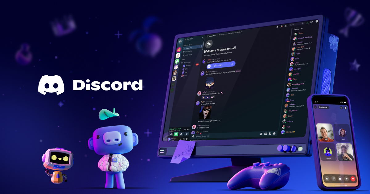
Positioned as the go-to place for friends and communities to socialize and play together, with an emphasis on user-owned spaces. Personality is playful and approachable, backed by visible safety infrastructure and tools for builders.
It blends a light, playful vibe with clear signals of structure and safety. The voice speaks like a friend from gaming culture while surfacing serious safety resources and tools for builders.
- Group Chat That’s All Fun & Games
- great for playing games and chilling with friends
- even building a worldwide community
- Customize your own space to talk, play, and hang out
- Explicit promise of play and socializing: “great for playing games and chilling with friends.”
- Community scale claim: “even building a worldwide community.”
- Customization focus: “Customize your own space to talk, play, and hang out.”
- Robust safety resources surfaced in navigation: Family Center, Safety Library, Teen Charter, Privacy and Transparency hubs.
- Ecosystem depth for creators and builders: Developers section with integrations, documentation, and case studies.
- Lead with fun and togetherness before features.
- Use short, friendly sentences with everyday words.
- Balance playful lines with clear, practical next steps.
- Highlight customization and ownership of the space.
- Acknowledge safety and wellbeing without heavy legal tone.
- Do not slip into corporate jargon or formalism.
- Do not over-explain technical details up front.
- Do not sound exclusive or elitist.
- Do not bury safety information or community guidance.
- Do not use complex sentences when a simple phrase works.
Design style
how the interface looks and feelsUI leans on rounded pills, bold outlines, and saturated gradients over frosted surfaces, giving a tactile, toy-like feel. Motion and layered shadows create depth while uppercase labels and thick borders keep actions obvious and quick to parse.
Color palette
10 colorsPrimary
The core brand color1Accent
Highlights, CTAs, and signals1Text
Headings and body ink2Surface
Backgrounds and canvases2Neutral
Borders, dividers, muted UI4High-contrast black and white base energized by Discord’s blurple (#5865f2) and an indigo accent (#b377f3), supported by cool grays. The palette reads playful yet legible, with blurple as the signature brand hit against clean white and near-black surfaces.
Typography
4 typefacesHeadings
Display type and titles1Body
Paragraphs and UI text1Supporting
Secondary and accent faces2Custom Ginto family leads with bold, chunky sans headings (Abcgintonord 800) and clean Abcginto variants for body, reinforcing a friendly, modern voice. Uppercase labels add punch; generous weight choices support loud headlines and simple scannability.
Export the brand kit
Assets
2 stylesheets · 405 colors · analyzed with gpt-5