Chime Fee-Free Banking - Checking, Savings, Credit & Cash Back
“Hi, We’re Chime. We unite everyday people to Unlock Financial Progress.”

Brand scorecard
Grade BA strong, trust-forward consumer brand with clear benefits and scale proof, held back by some category-generic visuals and repeated top-line claims.
Evolve the hero narrative from a list of benefits to a single, memorable story around “Unlock Financial Progress,” showing how the ecosystem fits together in a day-in-the-life.
Ownable fonts, green primary, and the “profit with our members” stance are differentiating, but glassy gradients and rounded cards feel category-common.
Headlines translate to concrete benefits with numbers and plain language; legal and partner disclosures are visible and specific.
Tone is steady across homepage, blog, and About: consumer-first, proof-backed, anti-fee; trademarks and footnotes are handled consistently.
Signature green with disciplined neutrals builds recognition, though gradients push toward trend rather than timelessness.
Proprietary type system is a real asset: readable, distinctive, and well-hierarchized across marketing and content.
“Unlock Financial Progress” and “profit with our members” are sticky, but the hero repeats benefits many rivals also claim; a stronger unifying story could lift recall.
AI Slop-o-meter
design + copy · lower is betterDistinctive brand system and proof-heavy copy rise above a trendy gradient-glass shell.
- Softly rounded cards with frosted-glass blur and layered shadows
- Heavy use of gradients and motion in hero visuals
- Proprietary type family across display and body (Chime Display Wide, Chime Saans)
- Consistent, quantified benefits front-and-center (3.75% APY, 5% cash back, 47,000+ ATMs)
- Dense trust stack with awards, reviews, and FDIC partner clarity
A fee-free, member-first banking experience that helps you spend, save, and build credit with early pay access, high-yield savings, and cash back.
Chime positions itself as a consumer-first fintech that fixes pain points of traditional banks: fees, delays, and credit access. The personality is approachable and confident, anchored in scale proof and clear, practical benefits like fee-free overdraft enrollment, early pay access, 3.75% APY savings, and 5% cash back while building credit.
They frame banking as working with you, not against you: “profit with our members, not from them,” backed by a business model based on interchange instead of punitive fees. The voice blends clear consumer benefits with scale and social proof to reduce trust barriers common in fintech.
Short headlines and bullets that foreground numeric benefits. Avoids jargon, uses plain claims with footnoted qualifiers. Frequent trust scaffolding: awards, reviews, FDIC partner disclosure. Repeats value anchors for recall: fee-free, early pay, cash back, build credit.
Short, low-friction imperatives centered on enrollment: “Get started.”
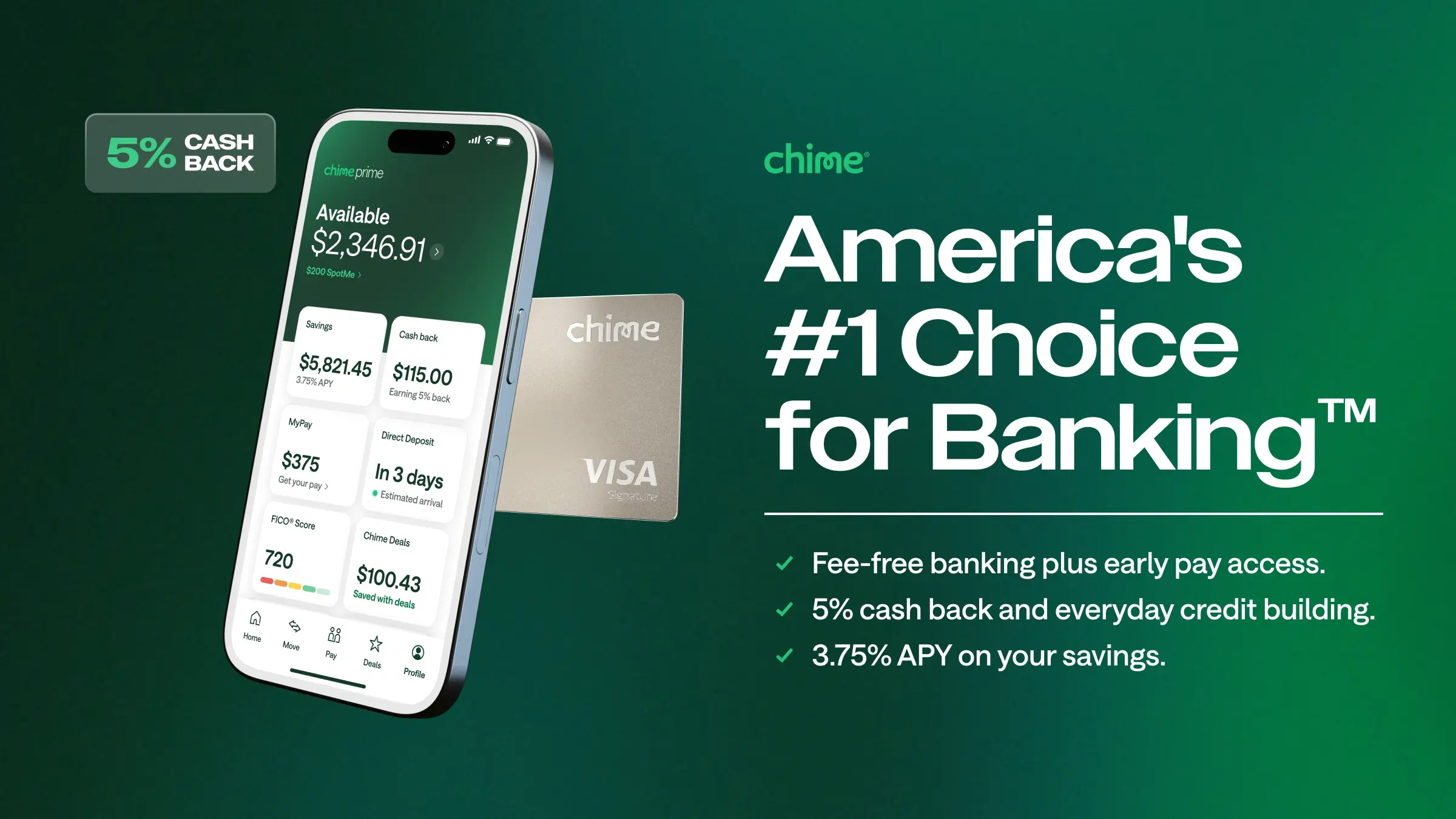
- America’s #1 Choice for Banking
- Fee-free banking plus early pay access.
- 5% cash back and build credit everyday.
- 3.75% APY on your savings
- We want to profit with our members, not from them.
- 47,000+ fee-free ATMs at retailers like Walgreens, CVS, Target, 7‑Eleven, and Circle K
- 1 Million+ 5‑star reviews in the Google Play and Apple App Stores
- Rated 5 stars for customer service by USA Today
- Deposits are FDIC insured up to $250k through The Bancorp Bank, N.A. or Stride Bank, N.A., Members FDIC
- Named NerdWallet’s Best Overall Checking Account of 2026
- Lead with one or two concrete benefits and a number.
- Use plain, empathetic language that speaks to everyday situations.
- Back claims with visible proof (awards, counts, partners) and clarifying footnotes.
- Center fairness and alignment (“member-first,” “no unnecessary fees”).
- Keep CTAs simple and low-commitment.
- Do not use lofty jargon or abstract promises without proof.
- Do not bury legal clarifications or partner-bank info when trust is at stake.
- Do not overcomplicate sentences or stack multiple concepts in one line.
- Do not adopt a snarky or elite tone that alienates mainstream users.
- Do not promise outcomes beyond the documented benefits.
Design style
how the interface looks and feelsSoftly rounded components float on layered, frosted surfaces with gradients and shadow, evoking a premium mobile app. Motion and transitions guide focus without clutter. The interface feels welcoming, with clear CTAs and high trust density through badges and disclosures.
Color palette
10 colorsPrimary
The core brand color1Accent
Highlights, CTAs, and signals2Text
Headings and body ink3Surface
Backgrounds and canvases2Neutral
Borders, dividers, muted UI2Bright white and off-white bases with deep blues for text and a signature deep green (#15744a) for primary actions and brand accents. Muted blues and grays stabilize trust content and legal notes, while gradients and elevation add a polished, app-forward feel.
Typography
4 typefacesHeadings
Display type and titles1Body
Paragraphs and UI text1Supporting
Secondary and accent faces2A proprietary system signals maturity and distinctiveness: Chime Display Wide for bold, compact headlines; Chime Saans for clear, readable body; Chime Serif and Chime Unlocked appear as accent or brand flourishes. Type feels modern and approachable, with strong hierarchy and legibility.
Export the brand kit
Assets
2 stylesheets · 47 colors · analyzed with gpt-5